
***Visual Analysis and Diagnostics for Machine Learning Models***
Introduction
Building a machine learning model doesn’t end when training is complete.
A trained model without evaluation is like a student who took an exam but never saw the results.
This is where model evaluation and visualization become critical.
Yellowbrick is a powerful Python library that helps us:
Visually diagnose model performance
Understand bias–variance tradeoffs
Compare multiple ML models
Explain complex metrics using intuitive plots
Yellowbrick sits perfectly between:
Scikit-learn (model building)
Matplotlib / Seaborn (visualization)
Why Do We Need Visual Model Evaluation?
Numerical metrics like accuracy or RMSE are useful, but they don’t always tell the full story.
Example:
Two models have 90% accuracy
One overfits badly
One generalizes well
Without visualization, you won’t notice the difference.
Yellowbrick helps answer:
Is my model overfitting or underfitting?
Are my classes separable?
Which features matter most?
How does performance change with training size?
What is Yellowbrick?
Yellowbrick is a machine learning visualization library built on top of scikit-learn.
Key Design Goals:
Works seamlessly with scikit-learn models
Minimal code changes
Visual diagnostics instead of raw numbers
Beginner-friendly and production-ready
Yellowbrick Visualizer Categories
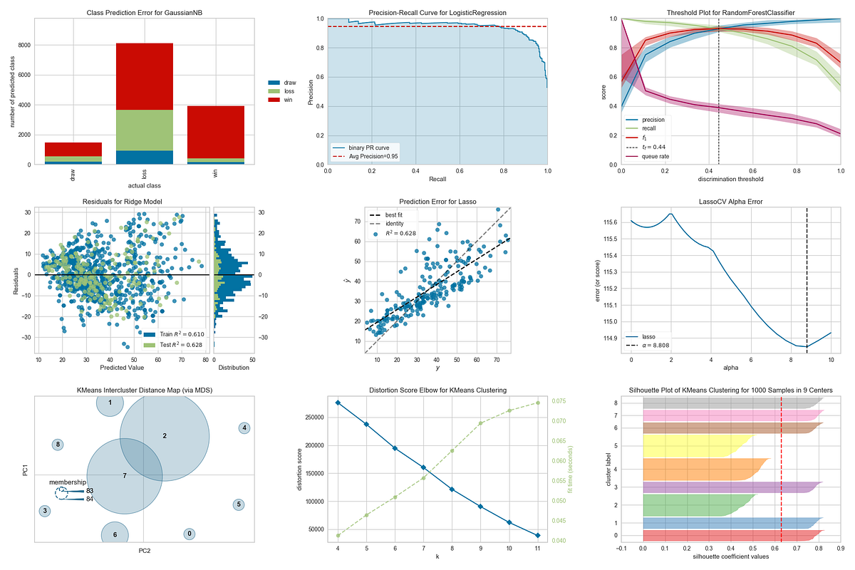
Yellowbrick visualizers fall into four major categories:
| Category | Purpose |
|---|---|
| Feature Analysis | Understand input data |
| Classification | Evaluate classifiers |
| Regression | Diagnose regression models |
| Clustering | Validate unsupervised models |
1. Feature Analysis Visualizers
These visualizers help you understand your dataset before modeling.
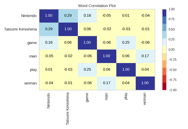
 Feature Correlation
Identifies multicollinearity
Helps remove redundant features
Rank Features
Ranks features using statistical scores
Useful for feature selection

Example Code:
from yellowbrick.features import Rank2D
from sklearn.datasets import load_breast_cancer

X, y = load_breast_cancer(return_X_y=True)

visualizer = Rank2D(algorithm='pearson')
visualizer.fit(X, y)
visualizer.transform(X)
visualizer.show()
2. Classification Model Evaluation
Yellowbrick shines brightest in classification diagnostics.
Confusion Matrix
Visual explanation of:
True Positives
False Positives
False Negatives
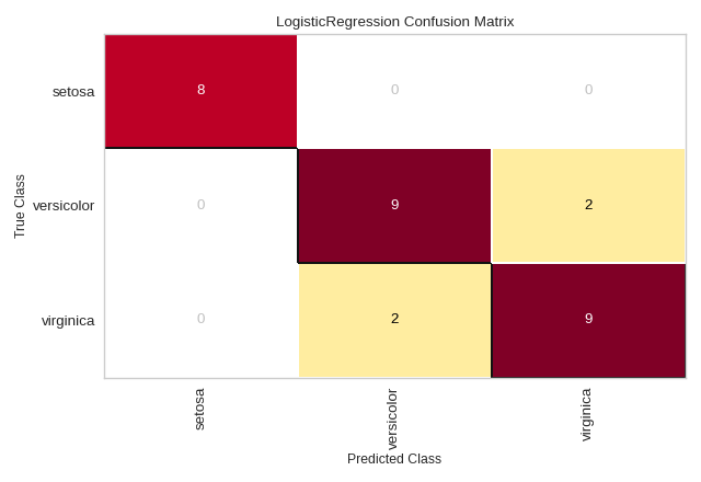
from yellowbrick.classifier import ConfusionMatrix
from sklearn.linear_model import LogisticRegression

model = LogisticRegression()
visualizer = ConfusionMatrix(model)

visualizer.fit(X_train, y_train)
visualizer.score(X_test, y_test)
visualizer.show()
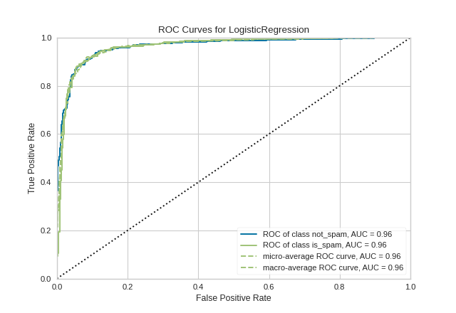
ROC–AUC Curve
Shows trade-off between True Positive Rate and False Positive Rate
Useful for imbalanced datasets
Precision-Recall Curve
Better than ROC when classes are highly skewed
3. Regression Model Diagnostics
Regression models need error understanding, not just RMSE.
Residuals Plot
Detects heteroscedasticity
Reveals non-linear patterns
Prediction Error Plot
Compares predicted vs actual values
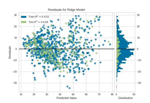

from yellowbrick.regressor import ResidualsPlot
from sklearn.linear_model import LinearRegression

model = LinearRegression()
visualizer = ResidualsPlot(model)

visualizer.fit(X_train, y_train)
visualizer.score(X_test, y_test)
visualizer.show()
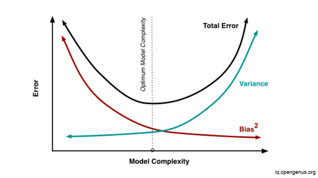
4. Bias–Variance Tradeoff (Learning Curves)
One of the most important concepts in ML.
Learning Curve Answers:
Do I need more data?
Is my model too simple?
Is my model overfitting?
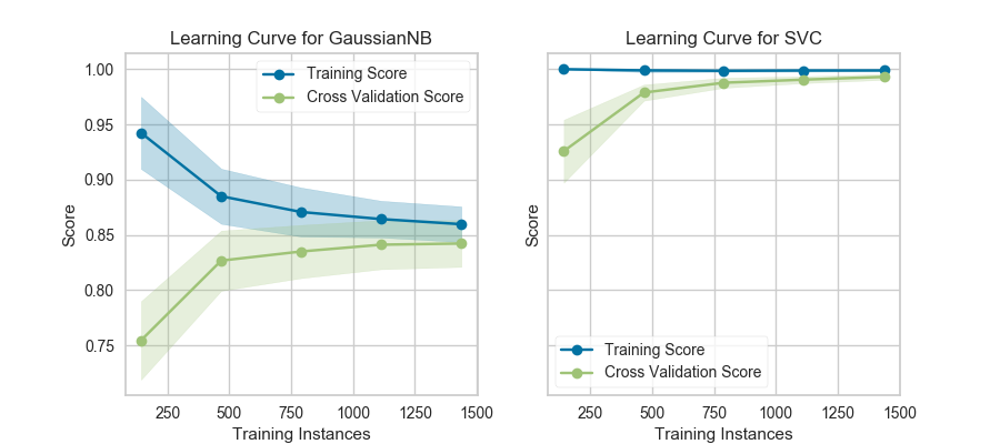
from yellowbrick.model_selection import LearningCurve

visualizer = LearningCurve(model, scoring='accuracy')
visualizer.fit(X, y)
visualizer.show()
5. Clustering Evaluation
Unsupervised learning is hard to evaluate—Yellowbrick makes it visual.
Elbow Method
Helps find optimal K in K-Means
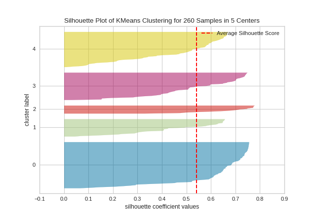
Silhouette Score
Measures cluster separation quality
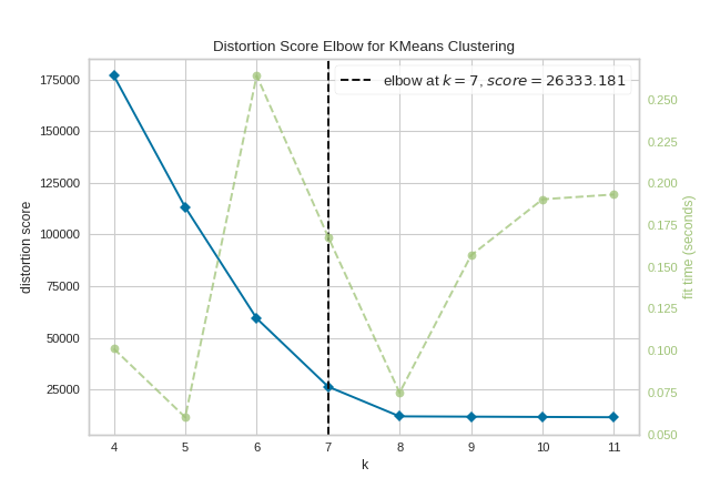
from yellowbrick.cluster import KElbowVisualizer
from sklearn.cluster import KMeans

model = KMeans()
visualizer = KElbowVisualizer(model, k=(2,10))

visualizer.fit(X)
visualizer.show()
Yellowbrick vs Traditional Metrics
| Aspect | Metrics Only | Yellowbrick |
|---|---|---|
| Interpretability | Low | High |
| Debugging | Hard | Easy |
| Teaching | Abstract | Visual |
| Decision Making | Risky | Confident |
Best Practices for Students
 Always visualize before optimizing Don’t trust accuracy alone Use learning curves early Combine metrics + visuals Interpret plots, don’t just generate them
When Should You Use Yellowbrick?
While learning machine learning
During feature engineering
Model comparison and tuning
Explaining models to non-technical stakeholders
Teaching ML concepts visually (perfect for classrooms!)
Yellowbrick transforms machine learning from numbers into insights.
It helps students:
See what models are doing
Understand why models fail
Improve models intelligently
Build intuition—not just code
If you are serious about model evaluation, Yellowbrick should be a default tool in your ML workflow.
Happy Learning!