Understanding Machine Learning Models Through Visualizations
 Why Visualization is Critical in Machine Learning
When students first build ML models, they usually focus on numbers:
-
Accuracy
-
Precision
-
Recall
-
F1 score
-
RMSE
-
ROC AUC
But numbers alone do not tell the full story.
Two models may have the same accuracy, but behave very differently.
For example:
| Model | Accuracy | Problem |
|---|---|---|
| Model A | 92% | Misclassifies minority class |
| Model B | 92% | Balanced predictions |
Without visualization, these issues are difficult to detect.
Visualization helps us:
 Understand data distribution Detect outliers Identify class imbalance Evaluate model predictions Explain model behavior Communicate results clearly
In real-world ML systems, visualization is essential for debugging models.
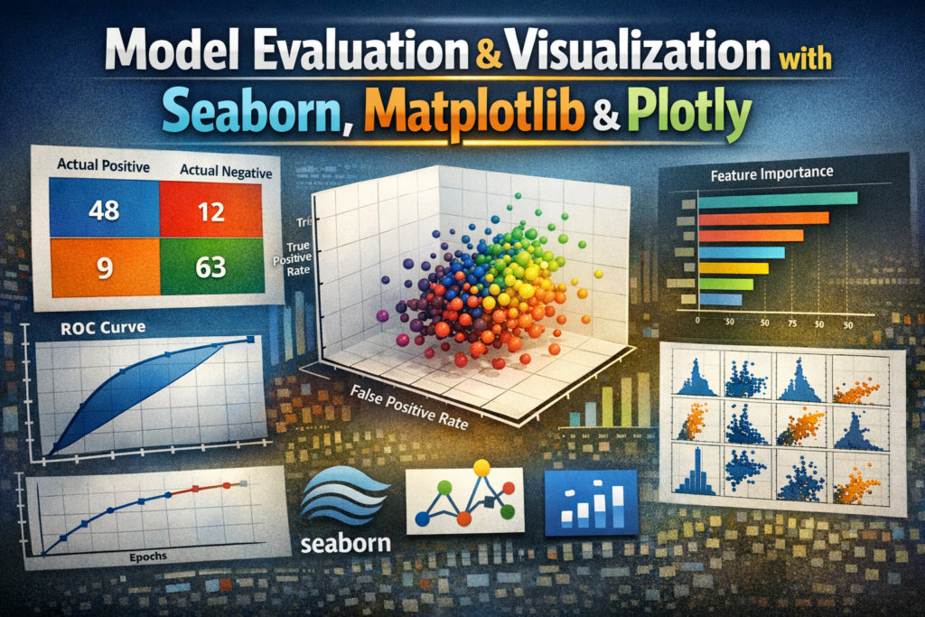
 The Three Most Important Visualization Libraries
Python has several visualization libraries, but three are most commonly used in machine learning:
| Library | Purpose |
|---|---|
| Matplotlib | Base plotting library |
| Seaborn | Statistical visualization |
| Plotly | Interactive visualizations |
Let’s understand each one.
 Matplotlib: The Foundation of Data Visualization
Matplotlib is the core plotting library in Python.
Almost every other visualization tool (including Seaborn) is built on top of it.
It allows you to create:
-
Line plots
-
Bar charts
-
Scatter plots
-
Histograms
-
Confusion matrices
-
ROC curves
Example: Basic Line Plot
import matplotlib.pyplot as plt

epochs = [1,2,3,4,5]
accuracy = [0.70,0.78,0.83,0.88,0.91]

plt.plot(epochs, accuracy)
plt.xlabel("Epochs")
plt.ylabel("Accuracy")
plt.title("Model Training Accuracy")
plt.show()
Output Insight
This plot helps us understand:
-
Is the model learning?
-
Is performance improving?
-
Is the model saturating?
 Visualizing Data Distribution
Before building a model, we must understand data distribution.
Histogram Example
plt.hist(df['age'], bins=20)
plt.title("Age Distribution")
plt.show()
This helps identify:
-
skewed data
-
outliers
-
normal distribution patterns
 Scatter Plot for Feature Relationships
Scatter plots help understand relationships between variables.
Example:
plt.scatter(df['study_hours'], df['exam_score'])
plt.xlabel("Study Hours")
plt.ylabel("Exam Score")
plt.show()
Insight:
We can observe whether features are correlated.
 Seaborn: Statistical Visualization Made Easy
Seaborn is built on top of Matplotlib but designed specifically for data science and statistics.
It provides:
Better default styles Built-in statistical plots Easy integration with pandas
Popular Seaborn Visualizations
Correlation Heatmap
import seaborn as sns

corr = df.corr()

sns.heatmap(corr, annot=True, cmap="coolwarm")
This helps us understand:
-
feature correlation
-
redundant features
-
multicollinearity
Example insight:
If two features have correlation > 0.9, one may be removed.
Pair Plot
Pairplots show relationships between multiple features simultaneously.
sns.pairplot(df, hue="target")
This helps us understand:
-
feature separation
-
class clustering
-
potential decision boundaries
Box Plot for Outlier Detection
sns.boxplot(x=df['salary'])
Boxplots reveal:
-
median
-
quartiles
-
extreme outliers
Outliers can significantly affect models like:
-
Linear Regression
-
KNN
-
SVM
Visualizing Model Evaluation
Visualization becomes especially powerful when evaluating models.
Let’s explore the most important evaluation plots.
 Confusion Matrix Visualization
A confusion matrix shows:
| Actual / Predicted | Positive | Negative |
|---|---|---|
| Positive | TP | FN |
| Negative | FP | TN |
Instead of numbers, we visualize it.
from sklearn.metrics import confusion_matrix

cm = confusion_matrix(y_test, y_pred)

sns.heatmap(cm, annot=True, fmt='d')
Insight
This allows us to easily see:
-
False positives
-
False negatives
-
model bias
 ROC Curve Visualization
ROC curves show model performance across thresholds.
from sklearn.metrics import roc_curve

fpr, tpr, thresholds = roc_curve(y_test, y_prob)

plt.plot(fpr, tpr)
plt.xlabel("False Positive Rate")
plt.ylabel("True Positive Rate")
A perfect model approaches the top-left corner.
Precision-Recall Curve
Important for imbalanced datasets.
Example:
-
Fraud detection
-
Disease prediction
from sklearn.metrics import precision_recall_curve
This plot shows trade-off between:
Precision vs Recall.
 Feature Importance Visualization
Many models provide feature importance scores.
Example:
importances = model.feature_importances_

sns.barplot(x=importances, y=features)
This reveals:
-
Which features influence predictions most
-
Which features can be removed
 Plotly: Interactive Visualization
Unlike Matplotlib and Seaborn, Plotly creates interactive charts.
Users can:
Zoom Hover for values Filter data Rotate plots
Example: Interactive Scatter Plot
import plotly.express as px

fig = px.scatter(
    df,
    x="age",
    y="income",
    color="purchased"
)

fig.show()
This allows:
-
interactive exploration
-
better presentation for stakeholders
3D Visualization Example
px.scatter_3d(
    df,
    x='age',
    y='income',
    z='spending_score',
    color='target'
)
This is helpful for:
-
clustering problems
-
feature relationships
Training Curve Visualization
When training models (especially deep learning), we visualize:
-
training loss
-
validation loss
Example:
plt.plot(history.history['loss'])
plt.plot(history.history['val_loss'])
If validation loss increases while training loss decreases:
 Overfitting is happening.
Visualizing Clustering Models
For clustering algorithms like K-Means, visualization is crucial.
plt.scatter(X[:,0], X[:,1], c=kmeans.labels_)
This allows us to see:
-
cluster boundaries
-
cluster density
Visualizing Decision Boundaries
For 2-feature datasets we can plot decision regions.
Example:
from mlxtend.plotting import plot_decision_regions
This shows:
-
how models classify different areas of the feature space.
Real ML Workflow with Visualization
A typical ML pipeline includes visualization at multiple stages.
Step 1 — Data Understanding
Use:
-
histograms
-
boxplots
-
pairplots
Step 2 — Feature Analysis
Use:
-
correlation heatmaps
-
scatter plots
Step 3 — Model Evaluation
Use:
-
confusion matrix
-
ROC curve
-
precision-recall curve
Step 4 — Model Explanation
Use:
-
feature importance plots
-
SHAP visualizations
-
LIME explanations
Best Practices for Visualization
Always visualize your data first
Never build models blindly.
Avoid cluttered charts
Too many elements reduce readability.
Choose the right plot
| Goal | Best Plot |
|---|---|
| Distribution | Histogram |
| Outliers | Boxplot |
| Correlation | Heatmap |
| Relationships | Scatter |
| Classification results | Confusion matrix |
Label everything clearly
Always include:
-
title
-
axis labels
-
legends
Common Interview Questions
Why is visualization important in ML?
Because it helps understand:
-
data distribution
-
feature relationships
-
model behavior
-
prediction errors
Difference between Matplotlib and Seaborn?
| Matplotlib | Seaborn |
|---|---|
| Base plotting library | Built on Matplotlib |
| More control | Easier statistical plots |
| More manual styling | Better default visuals |
Why use Plotly?
Because it provides:
-
interactive charts
-
dashboards
-
better presentation for stakeholders.
Final Takeaway
A good ML engineer does not rely only on metrics.
They rely on visual understanding of models and data.
Visualization helps you:
Debug models Detect data issues Explain predictions Build trust in AI systems
The best ML practitioners combine:
Statistics + Visualization + Interpretation
Happy Learning!